Saturday, April 25, 2015

America

History:
France and the United States became allies at the beginning of the 19th century after that had simultaneously overthrown the monarchs in Europe. Both wanted to have a government a democratic based government and therefore they created a neoclassicism design to display their political aspirations. The Declaration of Independence in 1776 was the marking point for the rise of architectural and interior design business. Benjamin Latrobe and Charles Bulfinch were considered the fathers of architecture within the United States.
The first style to emerge within America was Federal. Chairs specific to this time had curved armrests and straight legs. Daybeds were highly popular during this period as well. Common neoclassical motifs included lyres, harps, and crowns of laurel leaves. The American Eagle was also highly publicized. One of the most influential designers of this time was Duncan Phyfe. The Scotsman was renowned for his superb craftsmanship as well as beautiful veneers. He is known for creating the Green Room in the White House in addition to his sofas and side chairs.


Another increasingly popular style among the public was the Shaker style. Its interiors were sparse clean and well organized. It played a heavy emphasis up political and religious freedoms. There was almost two of everything within each building: two entrances, two stairwells, two sleeping quarters, and so on. It was designed this way for the purpose of there being one for a woman and one for a man. Architecture included round barns, ladder back chairs, and cast iron stoves. It was believed, "That is best, which works best."


The most well known style associated with interior design in America is Victorian. It was based strongly upon the "mother country" in terms of decor. It was elaborate, romantic, and emotional. Architecture was a status of wealth and those with money wanted people to know. House were very large and were filled with many small rooms; each with a particular function. The interior were typically dark and adorned with heavy drapery, dark wood, and wood floors. The exteriors of these buildings on the other hand were usually painted in bright colors. There were always two separate staircases: one for the public and one for the servants and children. These homes were designed to impress so the front of the home was solely for the purpose of the visitors while the back was the actual home area. 

Current Application:


Peer Review:
Additional Links!

Saturday, April 11, 2015

FrenchPeriods

History:

Throughout the world, most countries style of interior design was heavily influenced by religious and political history of the eras and led by their leaders. In France the rulers taste was most pervasive during the French Renaissance. Therefore, royal "taste" was a strong determining factor in the direction which each style would take. France was also central to the Romanesque and Gothic styles. The Early Renaissance style controlled the industry between 1484 and 1547. This was the main transitional period from Gothic into Renaissance. Rulers during this time were Charles VIII, Louis XII, and Francois I.


Since ornamentation was so elaborate during this period it required a lot of supervising and implementation. The job was of creating a room that was consistent and harmonious was so complex a new profession was born: the decorator. Not only did the position require the person to be able to actually design an environment but to also be able to convey this information over to the client in a concise and understandable manner. The decorators supervised the artisans to produce the highest quality of design.


One of the most influential patron of the arts was Francois I. He held a very transitional style combining Gothic forms with Italian Renaissance ornamentation. He held establish some of the most impressive architectural monuments of the time which included Chateau de Chambord, Chateau de Fountainbleau, and Chateau de Blois.


The architecture of this period was also very distinctive. There was no need for new religious structures which contributed to the increase in construction of palaces and chateaux. Exteriors also become much more important. Roofs were typically very steep, had multiple chimneys and an abundance of large windows due to the weather. These roofs often had two slopes with dormer windows. What was most unique is the the exterior typically did not reflect the style of the interior.

Current Applications:


Discussion Blogs:
Alexandra: I really liked how she described the background of the French Renaissance and then show all the different major architectural structures. I also like how she puts side by side comparisons of current applications.
Jackson: I really like her analysis of the Rococo style and the various different modern applications of today. 
Additional Links!

Saturday, March 7, 2015

Italian Renaissance

History:

The renaissance movement originated from Florence, Italy. From Florence it began to flourish throughout Rome and Venice. One of the major influences on the design of this era was a shift from a religious to a secular emphasis. Since the Roman Catholic church had gained so much power there were many issues linked to corruption and misconduct, therefore, there were many reforms throughout the church from Martin Luther. This also provoked a movement towards humanism. Everyone in Italy, whether they were rich or poor, they were strongly interested in the arts. Because of this increased interest, residential design become much more common. There was also a transition in the importance of comfort, convenience, and beauty from safety, strength, and protection. There was an early emphasis on the interior architecture of the structures versus the actual furniture being used. Horizontal geometry and symmetry were key characters in many Italian Renaissance designs as well.


Apartment style buildings for people were referred to as Palazzo. It displayed uses of progression, alternation, and repetition in many components of the facades in the designs. There were three separate divisions of the palazzo with compound windows and a heavy project cornice. The central courtyard represented one similar to that of the Roman domus. There were no hallways and people lived within the second and third floors only. The walls were pierced with a series of niches. Another similarity to Rome was that living quarters were like the insulas. On the ground floor, one would typically find vestibules, repair shops, summer apartments, kitchens, bathrooms, and storage areas. An identifiable component was the grand staircase to the piano nobile, or the main living area within the second floor.


Many examples of palazzos are still standing today like Palazzo Davanzati and Palazzo Farnese. Probably the most captivating, though, would be Palazzo Medici-Riccardi. Located in Florence, Italy, Michelozzo di Bartolommeo built the structure around three guiding principles. The first of these principles was symmetry. There was a central entrance with a vestibule that lead to a courtyard. On either side was an identical array of rooms that lined each side. The second was that they public rooms would be immediately accessible from the central entrance with the more private ones located deeper into the building. The final guideline was that the Palazzo would be divided into smaller apartments and that a single person would one a continuous set of rooms to themselves.

Current Applications:


Peer Reviews:
Additional Links! 
This link shows comparisons and contrasts between Renaissance architecture that was constructed in Italy and ones constructed in England.
https://www.youtube.com/watch?v=RewmKCeGce0

Saturday, February 28, 2015

The Americas

History:

Unlike most architectural and design styles that emerged in Europe, the American civilizations were not influenced by other previous styles. Since they were initially isolated from outside cultures, ancient American cultures were a completely new breed of design techniques and forms. The most common locations of these Mesoamerican people were the humid tropical low lands or the mountains where extreme climate shifts occurred.


While there were four main civilizations that made up the American design style, the Aztecs, Mayans, Incas, and Olmecs, they all shared a strong common belief in their polytheistic religions. Ceremonial centers were the pivotal point of a city. Temples were arranged throughout towns in order to provide spatial orientation. The pyramids weren't constructed for directional purpose or orientation, but to call attention to the gods and their powers. These pyramids were signs of praise and honor. With these religions, all came the heavily relied upon human sacrifice.


The Olmecs, also known as the "rubber people" were the first major civilization who reigned from 2000 B.C. to 200 B.C. They were highly renowned for their realistic artwork, jaguar symbolization, and sculptures created from jade. The people of this society were extremely intelligent that they created the first calendar in the western hemisphere as well as a hieroglyphic form of writing. La Venta was the first temple focused city. The town consisted of a ball court, the Great Pyramid of Earth, several smaller pyramids, burial grounds, and the giant stone head sculptures.


One of the most spectacular sites in the Olmec ancient history is Teotihucuan.  Meaning "place of the gods," a two mile stretch of street runs down the middle. At one end lies the Pyramid of the Sun and at the opposite, the Pyramid of the Moon. The stretch that runs down the middle was known as the Street of the Dead. The city was laid out in a grid system. There were no city walls which lead to believe that these were immensely powerful people with no outside enemies. This adds to the mystery of why the culture was a sudden disappearance.

Current Applications:


Peer Reviews:
Jackson: I really like how Jackson broke down the America's into sub-categories and really examined each individual civilization. I thought her examples were super cool, especially the foundation system that mimics Machu Picchu.
Miryam: I thought that current applications that Miryam found were a good way to show a modern twist on the America style, specifically the twisting sculpture in the lobby.
Additional Links!

Saturday, February 21, 2015

Gothic

History:

The Gothic style of design emerged from the city of Paris during the climax of the Black Plague and series of other world events in Europe. Churches began to become the center of daily life and therefore the competitions among the construction between cathedrals increased tremendously. Knighthood, chivalry, and artisans guilds also became increasingly popular.


With the fear of the Black Plague taking over Europe, the importance of the church and religion became ever more evident. The praise of the pope increased due to the promise of God's influence so wealth and authority was highly evident in the church. Worshipers flocked in order to seek protection from the horror's of the world. With the influx of new followers the size of churches also began to expand. Relics of saints were commonly replaced with adoration of the Virgin Mary. The heart motifs was strongly relevant throughout Gothic design styles.


Gothic designs were the production of the previously dominant Romanesque styles and the bridge to the creation of Renaissance. Some of the most important features that were taken away from the Gothic era were the pointed arch, ribbed vault, and flying buttress.


Most of the Romanesque's floor plans and structural components were evident in Gothic Cathedral designs, like the Latin cross path. There were chapels radiating from the apse and large stained glass windows upon the multiple tall walls. The heavily used vertical lines gave off the impression of modern day skyscrapers. High vaults commonly found in these cathedrals created new demands and therefore the ribbed vault was created. Arches were now pointed unlike the previous rounded style found in the Romanesque. One of the most defining features of the era was the flying buttress. All of this was meant to transcend a earthly experience.


Styles of the Gothic cathedral did vary from region to region. The French were the first to introduce the flying buttress with Notre Dame at Cartes. England's churches were lower and longer which was apparent in the Wells Cathedral. Germany was also similar to the French but with larger towers. Spain had wider and more complex cathedrals and Italy was well known for its use of polychromic decoration.

Current Applications:


Peer Reviews:
Mackenzie: I really like how with each of her design characteristics that she mentioned, she incorporated a very supporting image to provide visual support. I also thought the additional link about the Gothic style home was a very unique way of showing how the style is still prevalent.
Emma: I like how she focused more on comparing and contrasting the Gothic style in several countries like France, England, Germany, and Spain.

Additional Links!
This a documentary about some of the greatest cathedrals in history ever built.
https://www.youtube.com/watch?v=zH3lymFaTwU

Saturday, February 14, 2015

Romanesque

History:

The Romanesque style was initially created in 800 A.D. from Italy and Southern France. During this time Charles the Great was the reigning emperor of the Roman Empire. Some of his main focuses were the education of arts and learning of his people all while building schools and monasteries. Under his rule architecture grew astronomically, specifically because of the strong religious movements. He encourage the use of new technology when building his Roman structures. Nearly 1,600 churches were built between 1000 and 1100 A.D. The most significant style of these churches was the great abbey churches. With the influx in church structures, pilgrimages to Christian shrines were initiated. The Romanesque church design initially arose during the Early Christian era. While the basic basilica structure was still predominant, the nave, transept, and apse were simply modified in order to accommodate more people. These designs also began to incorporate semicircular arches and vaults.


Churches' lighting also improved drastically throughout the new churches. Colors like greens, blues, purples, and golds covered the interiors as well as richly decorated tapestries. Gilded statues were placed throughout churches underneath roofs constructed of masonry instead of wood. The bibles and chalices were made of gold, silver, or ivory and embellished with rubies, sapphires, pearls, and emeralds. 


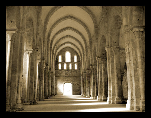
In 1118, St. Bernard established a monestary at Fontenay in Burgandy, France. Some of the produced goods were wool and iron. It was a center of religious and economic forces. The appearance of the structure was Austere and the walls were predominately blank with slightly painted nave arcades. 


While most of the church buildings are still standing and most are still being used, residential homes are not. Churches were constructed to last because of their heavy and hardy materials wood, mud, and twigs. These floors did not provide very much warmth or light. The floors were typically made of dirt which contributed to it commonly being wet and drafty. These homes were also prone to catching on fire which many did not typically survive. 
Current Applications:


Peer Reviews:
The first blog I read was Nicole's. I really like the one photo she found that shows a side by side comparison of all the major architectural components that define the Romanesque style. I really like the current example's, especially the bedroom one.
Next I read Jackson's blog and I thought it was interesting how she used her current applications as concert halls and mega churches. 
Additional Links!
This video examines the development and alternations that characterize Romanesque architecturla styles.
https://www.youtube.com/watch?v=rSiD5Jinpuw

Islamic Design

History:

Islamic design was focused around the teachings and ways of Mohammed. The style spread drastically over several regions in Africa, Europe, and Asia. What is most unique about this style is that there was a great variety depending upon the region in which is was found in it. Mohammed's farm was the first prototype for the Mosque, the Islamic's religious house of worship. The main features of a mosque were the perimeter wall, covered hall of columns, and a courtyard. Mosques' initial purposes were to come and pray for Allah.


One variation of Islamic design was Persian architecture. In Istanbul, Turkey, which was originally Constantinople, stands the Mosque of Sultan Ahmed. Constructed between 1609 and 1617, this structure also known as the "Blue Mosque," has a single main dome, six minarets, and eight secondary domes. The patterns found through this mosque originated from textiles. There are over 20,000 handmade tiles, 200 stained glass windows, and over fifty different tulip designs. Geometric and non-representational dominates the decor design.


In Delhi, India the Taj Mahal is the prime example of Islamic design in the region. The Muslims established Delhi as the Islamic capitol in the early twelfth century, so its location was more than appropriate. The ruler of this time was Mughal and he had a significant influence over the building initiatives including residential and secular buildings. The structure was completed in sixteen years between 1632-1648 C.E. as a resting place for his wife. It is one of the most iconic buildings and its highly recognized for white dome marble mausoleum. What isn't well known is that it wasn't built of solid marble, but in fact brick with a marble veneer.


Spain's Islamic design was a fusion between European and Islamic design practices. The Great Mosque of Cordoba reflects the design styles of this region. It used a hypostyle form of architecture.An even more renowned display of Islamic design is the Alhambra Palace. This large palace and fortress displays horseshoe arches, ogival arches, muqarnas-filled niches, and muqarnas domes. It was designed by Ahmar between 1250-1360 C.E.

Current Applications:

~  nice elegant eclectic design ...loving the #gray #neutral

We're about to remodel our kitchen & while in my mind I'm thinking Moroccan tiles/brass/teal, I love the quietness of earth-tones in this pic.  Maybe I can find a way to go Moroccan without being too crazy afterall...

Casbah Cove by Gordon Stein Design // #white #bath #morocco

Peer Reviews:
This first blog that I read was Cally's. Her blog was extremely well organized. I like how she broke down all the different areas and elaborated on them. The modern examples were phenomenal, especially the one with the Star of David design.
The next blog I read was Miryam's. She focuses more on the architectural components in her blog which is apparent in her current design applications.

Additional Links!
This video is a collaborative slide show of various Islamic architectural design applications.
https://www.youtube.com/watch?v=cv6NSjbrY6Q